


INNOVATIVE CONCEPTS FROM A TOP-TIER INTERIOR DESIGN COMPANY IN THE UAE
4SPACE is different from other luxury design companies. Armed with a profound understanding of the unique challenges of luxury design within the UAE, we strive to meet them with the unparalleled knowledge and skills of a multi-talented team of professionals.
Our F&B and restaurant consultants in the UAE are always keen on bringing client
satisfaction through consistently delivering quality and innovative interior and space
designs for virtually every application, be it for a restaurant.
Our expertise entails:
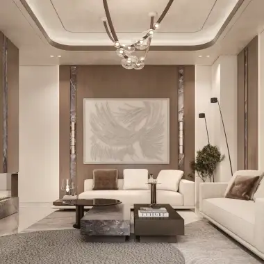
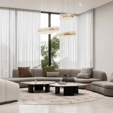
Residential interior design
Shop interior design Dubai
Restaurant design Dubai
Retail interior design Dubai
WE ARE ONE OF THE TOP INTERIOR DESIGN COMPANIES IN THE MIDDLE EAST
Led by major partners Amjad Hourieh and Firas Alsahin, our company has become one of the region’s most respected firms, with more than 15 years of industry experience.
Our interior designers have helped create environments that inspire and impact users by providing the local industry with our extensive practical knowledge, be it for retail, hospitality and commercial spaces, or residential and living spaces.
WE PROVIDE OUR SERVICES IN THESE REGIONS
Interior Design Abu Dhabi – Interior Design Dubai – Interior Design Riyadh
Interior Design Saudi Arabia – Interior Design United Arab Emirates
LUXURY INTERIOR DESIGN FOR UAE RESIDENTS
Great spaces make great businesses. Work success into the very fabric of your building with 4SPACE Interior Design.
WE CARE.
Our interior designers collaborate with you to get a clear understanding of your needs and requirements for the space, allowing them to produce a comprehensive & detailed plan that gives you an overview of the costs and time frame for sound decision-making.
WE DELIVER.
The best decisions are a result of the most thorough and meticulous planning. As such, our luxury interior design and F&B consultants in the UAE use physical models and mock-ups to examine the context of a space and deliver innovative solutions to better serve your company.
WE`RE CREATIVE.
As one of the best interior design companies in the United Arab Emirates, we have mastered the perfect combination of light, space, and all the fine details necessary to create an unforgettably luxurious experience for everyone utilising the space.
PLACE YOUR TRUST IN ONE OF THE TOP LUXURY INTERIOR DESIGN COMPANIES IN THE UAE
For us at 4SPACE, the success of a project is measured by the level of customer satisfaction. With an excellent reputation as the best interior designers in the UAE, we strive to provide our clients with an exceptional experience that exceeds expectations both in terms of quality and customer service. Whether you’re looking for a bespoke residential luxury interior design or a comprehensive F&B consultancy, we can help create the perfect ambiance that is sure to leave your customers impressed. Contact us today and let us take care of all your interior design needs.
You deserve nothing but the best – choose 4SPACE as your partner and get the most out of one of the top-tier interior design consultants. We look forward to making your dream living or working space come true!


