In the bustling city of Abu Dhabi, where modernity and tradition coexist in harmony, interior design plays a key role in shaping the atmosphere and ambiance of living spaces. Among the various elements that contribute to a well-designed interior, the importance of colors in interior design cannot be overstated. Colors possess a unique significance, influencing emotions, enhancing aesthetics, and creating a cohesive environment
Cultural Significance of Colors
Abu Dhabi is a city rich in cultural heritage, and colors play a crucial role in its traditions and rituals. Understanding the cultural meaning of colors is vital when incorporating them into interior design. For example, in Emirati culture, white denotes purity and is typically used as a foundational hue, while tones of gold symbolize prosperity and luxury. By collaborating with an interior design company in Abu Dhabi, you can skillfully incorporate these culturally significant hues into your interior design. This approach not only pays homage to local traditions but also creates a living environment that fosters a sense of belonging and identity.
The Importance of Colors in Interior Design
The importance of colors in interior design cannot be overstated, as they serve as a cornerstone in shaping the mood, functionality, and identity of any space. Colors have the power to influence emotions—bright tones like yellow can energize a room, while softer hues like blue evoke calmness and serenity.
In interior design, colors also play a practical role, helping define areas, highlight architectural features, and create illusions of space. For instance, lighter shades can make small spaces feel more expansive, while darker tones add depth and coziness.
In culturally rich regions like Abu Dhabi, colors hold additional significance, reflecting local traditions and values. By incorporating culturally meaningful hues, such as gold for luxury or white for purity, designers create spaces that feel both authentic and welcoming.
Mastering the use of colors ensures that interiors are not only visually stunning but also deeply connected to the purpose and personality of the space
The Colour Wheel
The colour wheel is a fundamental tool in interior design, helping designers create harmonious and balanced spaces. It organizes colours into three main categories: primary (red, blue, yellow), secondary (green, orange, purple), and tertiary (combinations of primary and secondary colours).
By understanding the relationships between colours on the wheel—such as complementary (opposite colours like blue and orange), analogous (neighbouring colours like yellow and green), and triadic (three evenly spaced colours like red, blue, and yellow)—designers can craft visually appealing palettes.
In interior design, the colour wheel is used to strike the perfect balance between contrast and harmony, ensuring that spaces feel cohesive yet dynamic. Whether you’re looking to create a bold statement or a soothing atmosphere, the colour wheel is an invaluable guide in selecting shades that work together seamlessly.
The Dimensions of Colour
Colour in interior design is more than just a visual element—it has three key dimensions that shape its impact: hue, value, and saturation.
- Hue refers to the basic identity of a colour, such as red, blue, or yellow. It is the foundation of any colour palette, helping to establish the overall mood of a space.
- Value defines the lightness or darkness of a colour. Lighter values, like pastels, create a sense of openness and airiness, while darker tones evoke intimacy and depth.
- Saturation measures the intensity or purity of a colour. Vibrant, highly saturated colours add energy and drama, whereas muted tones promote calmness and sophistication.
Understanding these dimensions allows interior designers to manipulate how a colour interacts with light, space, and other elements, creating an atmosphere that aligns with the purpose and personality of a room.
Progression and Contrast in Interior Design
Progression and contrast are essential principles in interior design that help create dynamic and visually appealing spaces. The importance of colors in interior design becomes evident when these principles are applied effectively.
Progression involves using a gradual transition of shades or tones to guide the eye smoothly across a room. For example, a gradient from light to dark hues within the same colour family can add depth and harmony to a space.
Contrast, on the other hand, highlights differences between colours to create visual interest. Pairing complementary colours, such as blue and orange, or using light and dark tones together, can make certain elements stand out, drawing attention to focal points like furniture or architectural details.
When used thoughtfully, progression and contrast leverage the importance of colors in interior design to achieve balance and ensure that every space feels intentional and engaging.
Colour Temperature and Mood in Interior Design
The importance of colors in interior design is closely tied to their temperature and the mood they evoke. Colours are categorized into warm, cool, and neutral tones, each influencing the atmosphere of a space differently.
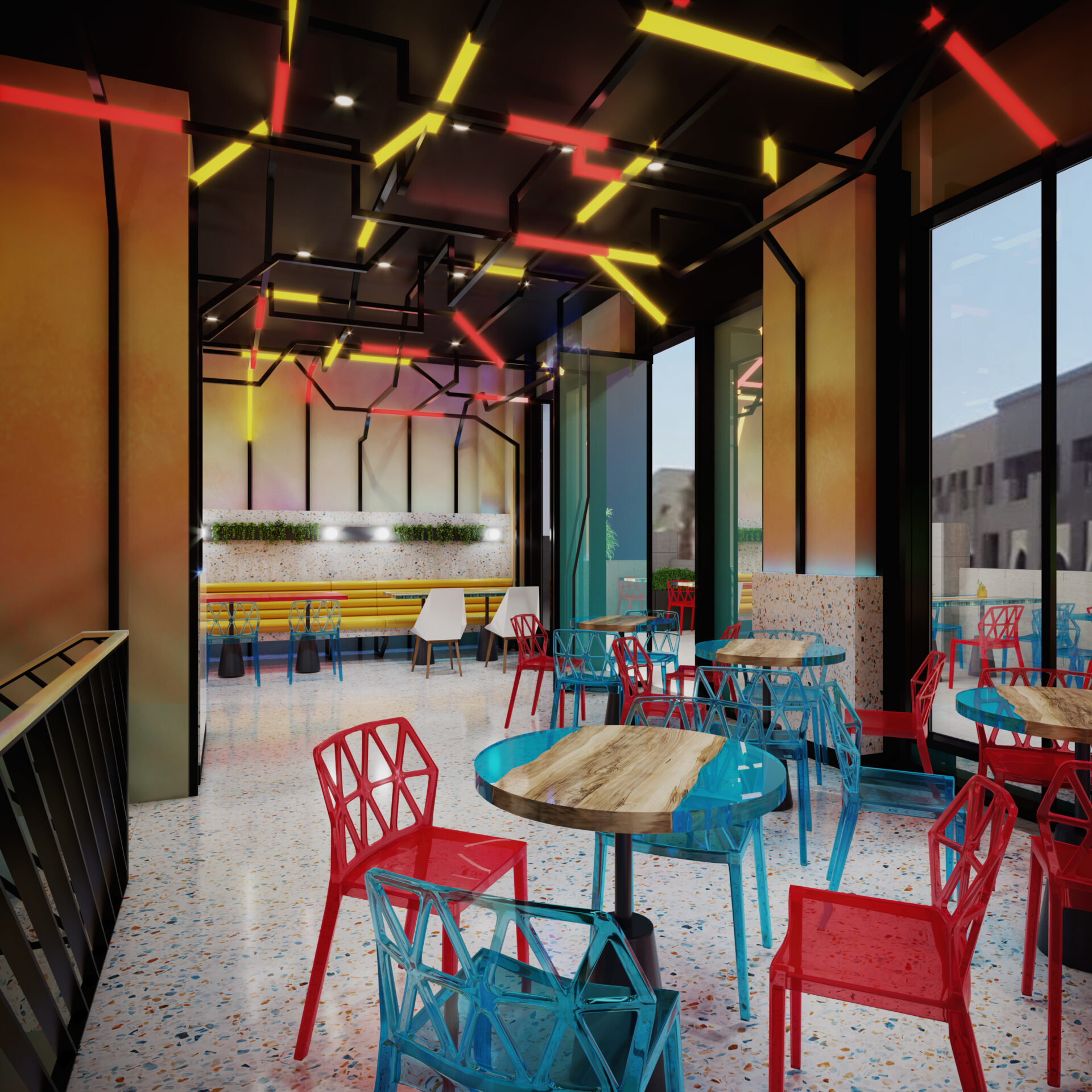
- Warm Colours: Shades like red, orange, and yellow exude energy, warmth, and passion. They are ideal for social spaces like living rooms or restaurants, where an inviting and lively ambiance is desired.
- Cool Colours: Hues such as blue, green, and purple create a calming and soothing effect. These are perfect for bedrooms, offices, or spaces designed for relaxation and focus.
- Neutral Colours: Tones like white, beige, and grey offer balance and versatility, serving as a backdrop for other colours or creating minimalist, timeless interiors.
By understanding colour temperature, designers can align the mood of a space with its purpose, highlighting the importance of colors in interior design in creating both functional and emotionally resonant environments.
The Effect of Colour on Space
Colour has a transformative impact on how a space is perceived, influencing its size, depth, and overall ambiance. Light colours, such as soft whites and pastels, can make small spaces feel larger and more open by reflecting natural light. On the other hand, darker shades like navy or charcoal create a sense of intimacy and coziness, ideal for larger rooms or spaces meant to feel private.
Additionally, the strategic use of accent colours can draw attention to specific areas or features, such as a bold wall in a neutral room or a brightly coloured piece of furniture. Patterns and contrasts also play a role in altering spatial perception, with vertical stripes elongating walls and horizontal patterns widening them.
Understanding these effects allows designers to manipulate spaces to suit the intended purpose, ensuring the design feels both practical and visually harmonious.
The Impact of Colour on Human Emotion and Behaviour
Colour has a profound influence on human emotion and behaviour, shaping how people feel and interact within a space. Warm colours like red, orange, and yellow evoke energy, passion, and excitement, making them ideal for lively areas such as restaurants or social spaces. In contrast, cool colours such as blue and green promote calmness, relaxation, and focus, often used in bedrooms, spas, and offices.
Neutral tones like beige or grey provide a sense of balance and sophistication, creating a serene environment without overwhelming the senses. Additionally, vibrant colours like bright pinks or bold purples can stimulate creativity and playfulness, while muted tones encourage a sense of stability and comfort.
By understanding the psychological effects of colour, designers can create environments that not only look appealing but also evoke the desired emotions and behaviours, ensuring spaces resonate deeply with their purpose.
Trends in Color and Interior Design
Color trends in interior design are constantly evolving, reflecting cultural shifts, technological advancements, and personal preferences. Recently, a shift toward earthy tones like terracotta, sage green, and warm neutrals has been prominent, offering a connection to nature and a sense of tranquility.
In line with Luxury Interior Design Trends in Dubai, bold jewel tones such as emerald green, sapphire blue, and deep ruby are also gaining popularity. These rich hues add a touch of opulence and sophistication to interiors, making them ideal for high-end spaces.
Another emerging trend is the use of monochromatic palettes with layered textures to create depth and visual interest. Pairing subtle tones with metallic accents like gold or brass enhances the overall elegance and aligns with modern luxury aesthetics.
These trends demonstrate how thoughtful use of color can elevate interiors, blending contemporary styles with timeless appeal.
Bring Your Vision to Life With 4SPACE
At 4SPACE, we specialize in transforming ideas into breathtaking realities. As one of the leading interior design companies in Dubai, we pride ourselves on our ability to craft spaces that seamlessly blend style, functionality, and innovation.
Our team of expert designers works closely with clients to understand their unique vision, ensuring every project reflects their personality, culture, and goals. Whether it’s a luxury villa, a contemporary office, or a chic restaurant, we combine cutting-edge design techniques with meticulous attention to detail to create truly remarkable spaces.
With a deep understanding of trends and the ability to tailor solutions to suit each client’s needs, we aim to deliver interiors that inspire and captivate. Let 4SPACE be your partner in bringing your vision to life and redefining the way you experience design.
FAQ
What Are the 5 Importances of Colors?
- Sets Mood: Colors influence emotions, creating calm, energy, or focus.
- Defines Space: They enhance perception, making spaces feel larger, smaller, or cozier.
- Reflects Identity: Colors represent personal or cultural values.
- Improves Functionality: Specific hues enhance productivity or relaxation.
- Creates Harmony: Balanced palettes ensure visually pleasing environments.
Why is the use of color important?
The use of color is important as it influences mood, helps us navigate our environment, and enhances functionality while creating harmony and reflecting identity.